> ## Documentation Index
> Fetch the complete documentation index at: https://docs.crossmint.com/llms.txt
> Use this file to discover all available pages before exploring further.
# UI Customization
> Style the identity verification screens that Crossmint shows inside your app with the appearance settings you already use for checkout
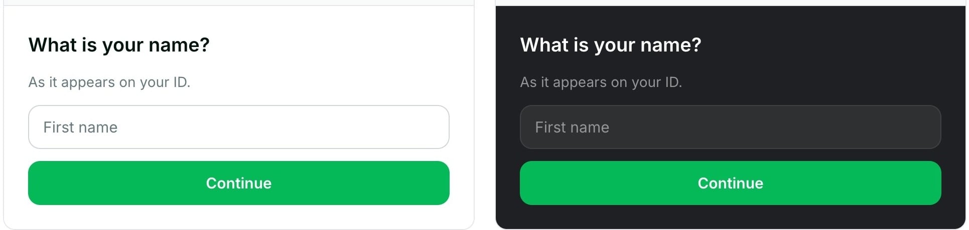
When a user needs to verify their identity, Crossmint shows a set of KYC screens inside your app: a consent screen, personal details, address, and, for full verification, an ID document and selfie step. This guide covers which `appearance` settings apply to those screens, what each one changes, the default values, and how to place the screens on your page.
 ## Prerequisites
* **An integration that shows the KYC screens**: the [embedded checkout](/onramp/quickstarts/react) for onramp or offramp, or the [standalone verification component](/onramp/guides/decouple-identity-verification).
## Before You Start
* The KYC screens read the same `appearance` object that you pass to the embedded checkout. If checkout already uses your brand, the KYC screens use it too, and there is nothing else to configure.
* Every setting is optional. A setting that you do not set uses the Crossmint default.
* If one value is not valid (for example, a color with a typo), the screens ignore all of your settings and show the default look. No error message shows, so test after each change.
* The ID document and selfie step (full verification only) has one light look and one dark look. Your colors and fonts do not apply to it. See [Light and Dark Mode](#light-and-dark-mode).
## Apply Your Theme
Pass the `appearance` prop to the embedded checkout as described in the [embedded checkout UI customization guide](/payments/embedded/guides/ui-customization). The KYC screens pick it up automatically when the order requires verification.
```tsx theme={null}
import { CrossmintEmbeddedCheckout } from "@crossmint/client-sdk-react-ui";
// Order created on your server with POST /api/2022-06-09/orders
const order = { orderId: "YOUR_ORDER_ID", clientSecret: "YOUR_ORDER_CLIENT_SECRET" };
;
```
If you [render the KYC step in your own view](/onramp/guides/decouple-identity-verification), pass the same object to the `appearance` prop of `CrossmintIdentityVerification` (`@crossmint/client-sdk-react-ui` 4.10.0 or later). Earlier versions show the default look.
## Appearance Settings and Where They Apply
Each setting controls one part of the KYC screens. The numbers in the table match the labels on the example screen. Color settings live under `appearance.variables.colors`, and component rules under `appearance.rules`.
## Prerequisites
* **An integration that shows the KYC screens**: the [embedded checkout](/onramp/quickstarts/react) for onramp or offramp, or the [standalone verification component](/onramp/guides/decouple-identity-verification).
## Before You Start
* The KYC screens read the same `appearance` object that you pass to the embedded checkout. If checkout already uses your brand, the KYC screens use it too, and there is nothing else to configure.
* Every setting is optional. A setting that you do not set uses the Crossmint default.
* If one value is not valid (for example, a color with a typo), the screens ignore all of your settings and show the default look. No error message shows, so test after each change.
* The ID document and selfie step (full verification only) has one light look and one dark look. Your colors and fonts do not apply to it. See [Light and Dark Mode](#light-and-dark-mode).
## Apply Your Theme
Pass the `appearance` prop to the embedded checkout as described in the [embedded checkout UI customization guide](/payments/embedded/guides/ui-customization). The KYC screens pick it up automatically when the order requires verification.
```tsx theme={null}
import { CrossmintEmbeddedCheckout } from "@crossmint/client-sdk-react-ui";
// Order created on your server with POST /api/2022-06-09/orders
const order = { orderId: "YOUR_ORDER_ID", clientSecret: "YOUR_ORDER_CLIENT_SECRET" };
;
```
If you [render the KYC step in your own view](/onramp/guides/decouple-identity-verification), pass the same object to the `appearance` prop of `CrossmintIdentityVerification` (`@crossmint/client-sdk-react-ui` 4.10.0 or later). Earlier versions show the default look.
## Appearance Settings and Where They Apply
Each setting controls one part of the KYC screens. The numbers in the table match the labels on the example screen. Color settings live under `appearance.variables.colors`, and component rules under `appearance.rules`.
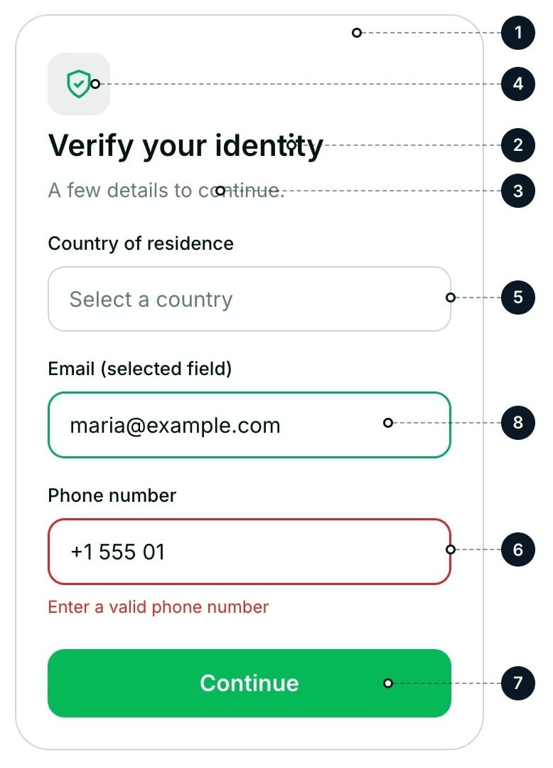 | # | Element | What it changes | Setting |
| :- | :- | :- | :- |
| 1 | Background | The background of all screens | `colors.backgroundPrimary` |
| 2 | Main text | Titles, field labels, and the text that the user types | `colors.textPrimary` |
| 3 | Secondary text | Subtitles, hints, and consent text | `colors.textSecondary` |
| 4 | Accent | Icons, links, the border of the selected field, and selected options. It does not change the button | `colors.accent` |
| 5 | Borders | Field borders | `colors.borderPrimary` |
| 6 | Errors | Error messages and the border of a field with an error | `colors.danger` |
| 7 | Main button | Background, text, hover, and disabled colors. Set your button color here | `rules.PrimaryButton` |
| 8 | Fields (optional) | Background, border, shadow, and placeholder of the fields. Without it, fields use the colors above | `rules.Input` |
| | Field labels (optional) | Font and color of the field labels. Without it, labels use `textPrimary` | `rules.Label` |
The checkout settings `variables.colors.warning`, `rules.Tab`, `rules.DestinationInput`, and `rules.ReceiptEmailInput` have no effect on the KYC screens.
## Default Colors
The screens use these colors when you do not set a value. Change only the colors that differ from your brand.
| Element | Setting | Default |
| :- | :- | :- |
| Background | `backgroundPrimary` | `#FFFFFF` |
| Main text | `textPrimary` | `#00150D` |
| Secondary text | `textSecondary` | `#67797F` |
| Accent | `accent` | `#04AA6D` |
| Borders | `borderPrimary` | `#D1D5DB` |
| Error | `danger` | `#DC2626` |
| Button | `PrimaryButton.colors.background` | `#05B959` |
| Button text | `PrimaryButton.colors.text` | `#FFFFFF` |
| Button hover | `PrimaryButton.hover.colors.background` | `#0BAF5C` |
| Disabled button | `PrimaryButton.disabled.colors.background` | `#E7E9ED` |
| Disabled button text | `PrimaryButton.disabled.colors.text` | `#67797F` |
| Icon tile fill | Calculated, not a setting | `#EDEFEE` |
| Element | Setting | Default |
| :- | :- | :- |
| Background | `backgroundPrimary` | `#1E2023` |
| Main text | `textPrimary` | `#FFFFFF` |
| Secondary text | `textSecondary` | `#939596` |
| Accent | `accent` | `#04AA6D` |
| Borders | `borderPrimary` | `#3E4043` |
| Error | `danger` | `#DC2626` |
| Button | `PrimaryButton.colors.background` | `#05B959` |
| Button text | `PrimaryButton.colors.text` | `#FFFFFF` |
| Button hover | `PrimaryButton.hover.colors.background` | `#0BAF5C` |
| Disabled button | `PrimaryButton.disabled.colors.background` | `#282C2F` |
| Disabled button text | `PrimaryButton.disabled.colors.text` | `#939596` |
| Icon tile fill | Calculated, not a setting | `#2E3032` |
Both modes use the Inter font, 12px corners, and 16px field text. Fields use `backgroundPrimary` unless `rules.Input.colors.background` sets another color. The fill behind the icon on the first screen is 7% of `textPrimary` mixed into `backgroundPrimary`.
## Light and Dark Mode
There is no `theme` setting. The screens pick the light or dark defaults from `variables.colors.backgroundPrimary`:
* An opaque dark color (for example `#1E2023`) selects the dark defaults.
* A light color, a transparent or semi-transparent color, or no value selects the light defaults.
The colors that you set replace only those values. If your app has a light mode and a dark mode, send the `appearance` that matches the mode the user sees.
The ID document and selfie step reads the same `backgroundPrimary` to pick its light or dark look, so it matches the other screens. It does not apply your other colors or fonts.
To get the dark look without picking every color yourself, set `backgroundPrimary` to a dark color and leave the rest unset.
## Fonts, Sizes, and Corners
| Setting | What it changes | Default |
| :- | :- | :- |
| `variables.fontFamily`, `fonts` | The typeface. Fonts load from Google Fonts only; a font served from your own domain does not load | Inter |
| `variables.borderRadius` | Corners of fields and the button | `12px` |
| `variables.fontSizeUnit` | Text size in fields and the button. The screens keep it between `4px` and `5px`: smaller field text makes iPhones zoom in on focus | `4px` (16px field text) |
| `variables.spacingUnit` | Space inside fields. The screens keep it between `2.5px` and `5px` | `3.33px` |
## Good Practices
Users type their name, date of birth, address, and ID number on these screens, often on a phone. These rules keep the screens easy to read.
| # | Element | What it changes | Setting |
| :- | :- | :- | :- |
| 1 | Background | The background of all screens | `colors.backgroundPrimary` |
| 2 | Main text | Titles, field labels, and the text that the user types | `colors.textPrimary` |
| 3 | Secondary text | Subtitles, hints, and consent text | `colors.textSecondary` |
| 4 | Accent | Icons, links, the border of the selected field, and selected options. It does not change the button | `colors.accent` |
| 5 | Borders | Field borders | `colors.borderPrimary` |
| 6 | Errors | Error messages and the border of a field with an error | `colors.danger` |
| 7 | Main button | Background, text, hover, and disabled colors. Set your button color here | `rules.PrimaryButton` |
| 8 | Fields (optional) | Background, border, shadow, and placeholder of the fields. Without it, fields use the colors above | `rules.Input` |
| | Field labels (optional) | Font and color of the field labels. Without it, labels use `textPrimary` | `rules.Label` |
The checkout settings `variables.colors.warning`, `rules.Tab`, `rules.DestinationInput`, and `rules.ReceiptEmailInput` have no effect on the KYC screens.
## Default Colors
The screens use these colors when you do not set a value. Change only the colors that differ from your brand.
| Element | Setting | Default |
| :- | :- | :- |
| Background | `backgroundPrimary` | `#FFFFFF` |
| Main text | `textPrimary` | `#00150D` |
| Secondary text | `textSecondary` | `#67797F` |
| Accent | `accent` | `#04AA6D` |
| Borders | `borderPrimary` | `#D1D5DB` |
| Error | `danger` | `#DC2626` |
| Button | `PrimaryButton.colors.background` | `#05B959` |
| Button text | `PrimaryButton.colors.text` | `#FFFFFF` |
| Button hover | `PrimaryButton.hover.colors.background` | `#0BAF5C` |
| Disabled button | `PrimaryButton.disabled.colors.background` | `#E7E9ED` |
| Disabled button text | `PrimaryButton.disabled.colors.text` | `#67797F` |
| Icon tile fill | Calculated, not a setting | `#EDEFEE` |
| Element | Setting | Default |
| :- | :- | :- |
| Background | `backgroundPrimary` | `#1E2023` |
| Main text | `textPrimary` | `#FFFFFF` |
| Secondary text | `textSecondary` | `#939596` |
| Accent | `accent` | `#04AA6D` |
| Borders | `borderPrimary` | `#3E4043` |
| Error | `danger` | `#DC2626` |
| Button | `PrimaryButton.colors.background` | `#05B959` |
| Button text | `PrimaryButton.colors.text` | `#FFFFFF` |
| Button hover | `PrimaryButton.hover.colors.background` | `#0BAF5C` |
| Disabled button | `PrimaryButton.disabled.colors.background` | `#282C2F` |
| Disabled button text | `PrimaryButton.disabled.colors.text` | `#939596` |
| Icon tile fill | Calculated, not a setting | `#2E3032` |
Both modes use the Inter font, 12px corners, and 16px field text. Fields use `backgroundPrimary` unless `rules.Input.colors.background` sets another color. The fill behind the icon on the first screen is 7% of `textPrimary` mixed into `backgroundPrimary`.
## Light and Dark Mode
There is no `theme` setting. The screens pick the light or dark defaults from `variables.colors.backgroundPrimary`:
* An opaque dark color (for example `#1E2023`) selects the dark defaults.
* A light color, a transparent or semi-transparent color, or no value selects the light defaults.
The colors that you set replace only those values. If your app has a light mode and a dark mode, send the `appearance` that matches the mode the user sees.
The ID document and selfie step reads the same `backgroundPrimary` to pick its light or dark look, so it matches the other screens. It does not apply your other colors or fonts.
To get the dark look without picking every color yourself, set `backgroundPrimary` to a dark color and leave the rest unset.
## Fonts, Sizes, and Corners
| Setting | What it changes | Default |
| :- | :- | :- |
| `variables.fontFamily`, `fonts` | The typeface. Fonts load from Google Fonts only; a font served from your own domain does not load | Inter |
| `variables.borderRadius` | Corners of fields and the button | `12px` |
| `variables.fontSizeUnit` | Text size in fields and the button. The screens keep it between `4px` and `5px`: smaller field text makes iPhones zoom in on focus | `4px` (16px field text) |
| `variables.spacingUnit` | Space inside fields. The screens keep it between `2.5px` and `5px` | `3.33px` |
## Good Practices
Users type their name, date of birth, address, and ID number on these screens, often on a phone. These rules keep the screens easy to read.
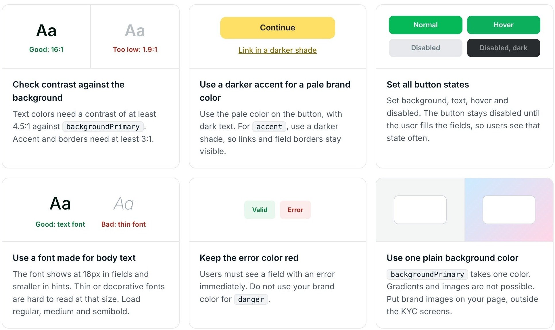 * **Check contrast against the background.** Text colors need a contrast of at least 4.5:1 against `backgroundPrimary`. Accent and borders need at least 3:1.
* **Use a darker accent for a pale brand color.** Use the pale color on the button, with dark text. For `accent`, use a darker shade so links and field borders stay visible.
* **Set all button states.** Set background, text, hover, and disabled. The button stays disabled until the user fills the fields, so users see that state often.
* **Use a font made for body text.** The font shows at 16px in fields and smaller in hints. Thin or decorative fonts are hard to read at that size. Load the regular, medium, and semibold weights.
* **Keep the error color red.** Users must see a field with an error immediately. Do not use your brand color for `danger`.
* **Use one plain background color.** `backgroundPrimary` takes one color. Gradients and images are not possible. Put brand images on your page, outside the KYC screens.
## Place the Screens on Your Page
The KYC screens show inside an iframe on your page. The iframe shows one screen at a time. Its height changes from screen to screen, and each screen has its Continue button at the bottom.
* **Check contrast against the background.** Text colors need a contrast of at least 4.5:1 against `backgroundPrimary`. Accent and borders need at least 3:1.
* **Use a darker accent for a pale brand color.** Use the pale color on the button, with dark text. For `accent`, use a darker shade so links and field borders stay visible.
* **Set all button states.** Set background, text, hover, and disabled. The button stays disabled until the user fills the fields, so users see that state often.
* **Use a font made for body text.** The font shows at 16px in fields and smaller in hints. Thin or decorative fonts are hard to read at that size. Load the regular, medium, and semibold weights.
* **Keep the error color red.** Users must see a field with an error immediately. Do not use your brand color for `danger`.
* **Use one plain background color.** `backgroundPrimary` takes one color. Gradients and images are not possible. Put brand images on your page, outside the KYC screens.
## Place the Screens on Your Page
The KYC screens show inside an iframe on your page. The iframe shows one screen at a time. Its height changes from screen to screen, and each screen has its Continue button at the bottom.
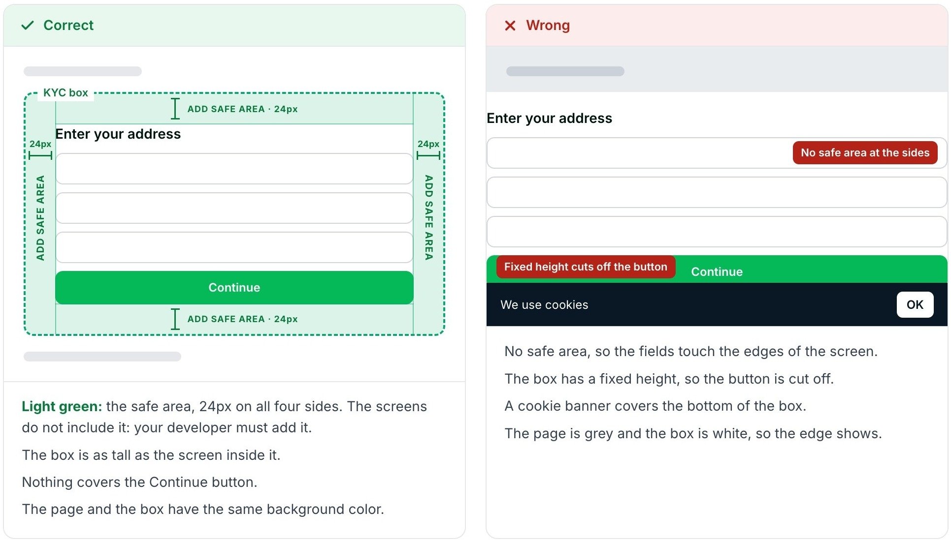 * **Safe area.** Leave 24px of space on all four sides of the iframe. The screens do not include it; your page must add it.
* **Height.** Let the iframe grow with the screen inside it. Do not set a fixed height, or the Continue button gets cut off.
* **Overlays.** Nothing should cover the Continue button, such as a cookie banner or a bottom bar.
* **Background.** Give your page the same background color as `backgroundPrimary`, or the edge of the iframe shows.
* **Width.** On phones, keep the 24px safe area on each side inside the screen width and let the iframe fill the remaining space. On desktop, use the same width as your checkout.
* **Camera.** The ID document and selfie step uses the camera. The Crossmint SDK allows it on the iframe. If you render the iframe without the SDK, allow the camera on it with `allow="camera"`.
* **Narrow phones.** Test on a screen 360px wide. Many Android phones have this width.
## What You Cannot Change
| Item | How it works today |
| :- | :- |
| Icon on the first screen | Crossmint icon, in the `accent` color |
| Text on the screens | Not editable. The language follows the user's browser, or the `locale` that you set |
| Order and layout of screens | The screens change with the user's country and the amount |
| ID document and selfie step | Light or dark only. For additional customizations, ask your Crossmint contact |
| Icon tile fill | Calculated from your text and background colors |
## Test Your Theme
Run these checks in staging before you go live.
* Your checkout settings show on the KYC screens.
* Light mode and dark mode, if your app has both.
* A full verification with a higher amount: the ID document and selfie step shows in the correct mode.
* An empty field and an incorrect value: the error color shows.
* The hover and disabled states of the button.
* A phone 360px wide and a desktop: the button is fully visible and the page does not scroll sideways.
## Next Steps
Full list of appearance settings, with code
Render the verification step in your own view
* **Safe area.** Leave 24px of space on all four sides of the iframe. The screens do not include it; your page must add it.
* **Height.** Let the iframe grow with the screen inside it. Do not set a fixed height, or the Continue button gets cut off.
* **Overlays.** Nothing should cover the Continue button, such as a cookie banner or a bottom bar.
* **Background.** Give your page the same background color as `backgroundPrimary`, or the edge of the iframe shows.
* **Width.** On phones, keep the 24px safe area on each side inside the screen width and let the iframe fill the remaining space. On desktop, use the same width as your checkout.
* **Camera.** The ID document and selfie step uses the camera. The Crossmint SDK allows it on the iframe. If you render the iframe without the SDK, allow the camera on it with `allow="camera"`.
* **Narrow phones.** Test on a screen 360px wide. Many Android phones have this width.
## What You Cannot Change
| Item | How it works today |
| :- | :- |
| Icon on the first screen | Crossmint icon, in the `accent` color |
| Text on the screens | Not editable. The language follows the user's browser, or the `locale` that you set |
| Order and layout of screens | The screens change with the user's country and the amount |
| ID document and selfie step | Light or dark only. For additional customizations, ask your Crossmint contact |
| Icon tile fill | Calculated from your text and background colors |
## Test Your Theme
Run these checks in staging before you go live.
* Your checkout settings show on the KYC screens.
* Light mode and dark mode, if your app has both.
* A full verification with a higher amount: the ID document and selfie step shows in the correct mode.
* An empty field and an incorrect value: the error color shows.
* The hover and disabled states of the button.
* A phone 360px wide and a desktop: the button is fully visible and the page does not scroll sideways.
## Next Steps
Full list of appearance settings, with code
Render the verification step in your own view