

CrossmintEmbeddedOfframp takes an appearance prop with the same object as the embedded checkout. For the full list of variables and rules in that object, see the onramp UI Customization guide. This guide covers which of them the offramp screens use, what each one changes, the default values, and how to test your theme.
Prerequisites
- An integration that renders the offramp: set up
CrossmintEmbeddedOfframpas in the React quickstart or the React Native quickstart.
Before You Start
- If checkout already uses your brand, pass the same
appearanceobject to the offramp. - Every setting is optional. A setting that you do not set uses the Crossmint default.
- If a value does not fit the
appearanceschema, such as a color that is not a valid CSS color or a value of the wrong type, the offramp ignores all of your settings and shows the default look. - If a value contains CSS syntax, such as
;,{,},<,>,@,url(, a CSS comment, a backslash, or an unbalanced quote or parenthesis, the offramp drops only that value and uses the default for it. AfontsURL on a host that the offramp does not accept (see Fonts, Sizes, and Corners), or with a quote, a backslash,<,>, or a line break, is dropped the same way. - No error message shows in either case, so test after each change.
- The identity verification step inside the offramp uses the same
appearance. See Identity Verification UI Customization for those screens.
Apply Your Theme
Define theappearance object once, outside your components:
offrampAppearance.ts
appearance prop. Keep the other props and events from the quickstart.
- React
- React Native
components/Withdraw.tsx
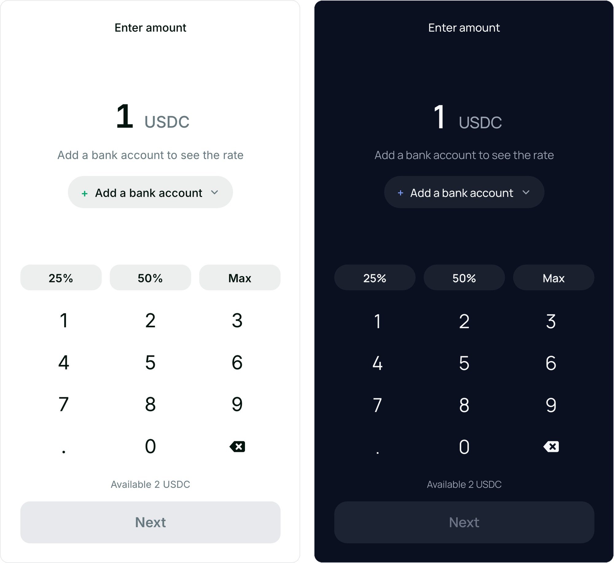
Appearance Settings and Where They Apply
Color settings live underappearance.variables.colors, and component rules under appearance.rules. On every screen, backgroundPrimary is the background and textPrimary is the default text color. The background fills the whole component, including the padding around the screens. The panel fill is calculated from those two colors (see Default Colors).
The checkout settings
rules.DestinationInput, rules.ReceiptEmailInput, rules.FeeSummary, and rules.GlobalMessage have no effect on the offramp.
Default Colors
The screens use these colors when you do not set a value. Change only the colors that differ from your brand.
The panel fill is 7% of
textPrimary mixed into backgroundPrimary. In light mode, the button text and its hover text take your backgroundPrimary color unless you set them. The hover text is a separate setting from PrimaryButton.colors.text, so set PrimaryButton.hover.colors.text too when you change the button text.
Light and Dark Mode
There is notheme setting. The offramp picks the light or dark defaults from variables.colors.backgroundPrimary:
- An opaque dark color (for example
#1E2023) selects the dark defaults. - A light color, a transparent or semi-transparent color, or no value selects the light defaults.
appearance that matches the mode the user sees.
Fonts, Sizes, and Corners
rules.Label, rules.Input, and rules.PrimaryButton can set their own font, and rules.Input and rules.PrimaryButton their own borderRadius. For the component’s height and width, see Sizing.
What You Cannot Change
Test Your Theme
Try yourappearance values in your own app against a staging project, with staging API keys, before you use them in production.
The component reloads the offramp when the value of appearance changes, so each change shows on the next load. Pick the theme before you render the component rather than while a user is withdrawing.
Run these checks in staging before you go live:
- Check light mode and dark mode, if your app has both.
- Check Enter amount, Withdraw to, Add a bank account, and Review & confirm.
- Enter an amount below the minimum and check that the error color shows.
- Check the hover and disabled states of the button. Next stays disabled until the user picks a bank account and enters an amount.
- Check the identity verification step with a user who is not verified yet.
Next Steps
Embedded Offramp Reference
Props, events, statuses, and sizing
Identity Verification UI Customization
Style the KYC step inside the offramp